On air · 3 of 3 networks
Distinctive BAT
- distinctivebat.com
- Marketing & Advertising
- IE
- 10 employees
Distinctive BAT’s ads on LinkedIn, Meta and Google, recorded by adsrunning. Browse the latest here for free. Sign up free to see all 206. Watch Distinctive BAT with Starter to get each new one in your feed.
Watchlist with Starter · $49/mo
| Network | Status | Live ads | Nov 2025LinkedIn activity · 52 weeksOct 2026 | Checked | Next step |
|---|---|---|---|---|---|
| Running | 54 | Checked 30 Oct 2026 | See all 206 ads → | ||
| Meta | Running | 4 | Active ads on the Meta Ad Library, all countries | Checked 27 Oct 2026 | Collect them with the API → |
| Running | 23 | Ads on the Google Ads Transparency Center | Checked 27 Oct 2026 | Collect them with the API → |
Distinctive BAT has 54 live LinkedIn ads. Its Facebook page had 4 active ads on 27 Oct 2026, and we recorded 23 Google ads on 27 Oct 2026.
Latest ads
- LINKEDIN · IMAGESince 21 Oct 2026
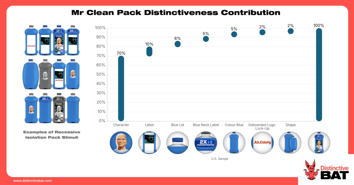
The benefits of a clear hero. While many pack assets can be the sum of their parts when it comes to distinctiveness, some have the benefits of a clear hero. Mr Clean is one such brand, with a real hero in the character. He alone accounts for 70% of packaging distinctiveness! Having such a hero on-pack allows great flexibility. The brand can launch new extensions more easily or even shift away from its core blue colour when introducing new scents, without losing distinctiveness. Once Mr Clean is front and centre, that is pretty much enough. Equally important, it allows the brand to tweak individual SKUs to improve on-shelf category navigation. Character assets are some of the best at this; the likes of M&M’s and The Laughing Cow can attest to this. But there are also other ways in, whether that is through icons/elements (Heinz, Hendrick’s), pattern/structure (Crosta Mollica), a disruptive feature (Angostura Bitters, Maker's Mark) or shape (Toblerone, Kikkoman) Read more at the link 👇
- LINKEDIN · IMAGESince 21 Oct 2026
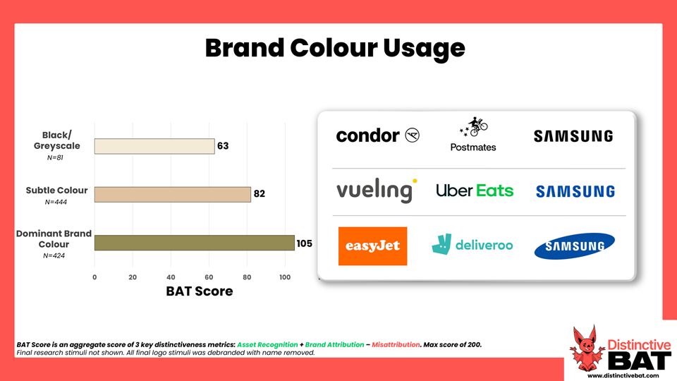
How important is colour in driving distinctiveness? Colour, in isolation, is one asset that rarely ranks among the top-scoring elements. However, its importance as a supporting player is very much evident and highlighted when we pick apart its impact on logos as part of our meta-analysis on logo distinctiveness. Across a spectrum of logos: from those that are colourless (i.e. black) to those with subtle use of colour, and finally to those utilising a dominant brand colour, the stronger the use of colour, the more distinctive it generally is. We see uplifts of 19 points on average from black/grey to a subtle use of colour, and uplifts of 42 points when a dominant brand colour is used as part of the logo. Samsung is one example where this trend plays out at an individual level, with declines in scores mirroring its recent evolution from a solid block of colour through to the black text-only version used now.
- LINKEDIN · IMAGESince 21 Oct 2026
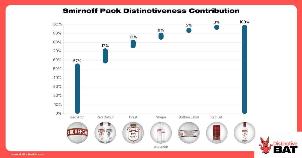
One of the challenges of standard Distinctive Brand Asset research, which sometimes draws criticism, is that testing assets in isolation overlooks how distinctive assets appear in the real world. Take Smirnoff, for example. While their red arch scores admirably on its own, red in isolation does less so. However, testing it in context on the bottle reveals the true importance of these assets. The red arch accounts for over 55% of the distinctiveness contribution for the bottle. Furthermore, with another 17% driven by the colour red, and the lockup being the main source of that colour, its overall importance jumps well past 70%. Augmenting the testing of assets in isolation by triangulating asset performance with additional data points can really help round out DBA and packaging research, and ensure clarity on what DBAs you should elevate or even deprioritise across the range. Read more in the link 👇
- LINKEDIN · IMAGESince 6 Oct 2026
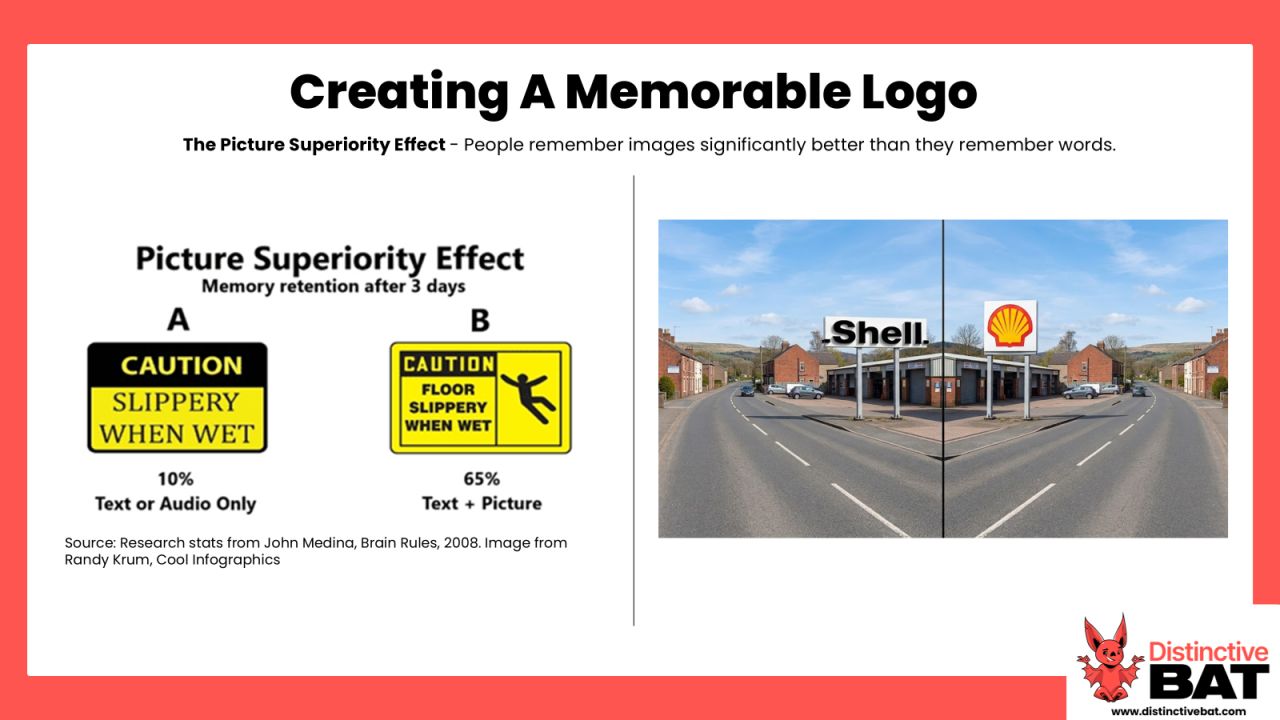
When we discuss improving levels of distinctiveness and utilising DBAs, we are generally talking about what happens beyond the logo. In most cases, the logo and a consistent application and elevation should simply be a given. That said, because so much of a brand's identity cascades from that primary mark, it can significantly influence a brand's direction when planning for long-term distinctiveness. The logo debranding trend seen in recent years, which has focused on the paring back of logos, highlights the negative knock-on effects a poorly thought-out design can have on the rest of a brand. In addition, relying solely on words within a logo to communicate a brand is a misguided perspective. The Dual Coding Theory, for example, suggests that the brain processes verbal and visual information through two distinct channels. When a logo utilises both text and a distinctive graphic element, the brain creates two separate "memory traces": one for the word and one for the image. I like an even simpler example of this to paint the picture. Which would stick more in your mind if you were driving down the road: the word “Shell” written out in plain letters on a big poster, or the iconic brand icon?
- LINKEDIN · IMAGESince 8 Jul 2026
We’re hiring for a great role, based in either Dublin or London, working across both Distinctive BAT and Salience+. We're seeking an Insight & Research Manager to deliver Distinctive Brand Asset and Category Entry Point research (and tracking) projects for some fantastic brands across a range of industries. We work with such a wide variety of companies, including some of the most iconic brands in the world, from the likes of Spotify, Audi, Paddy Power, MARS Foods, Pizza Hut, Molson Coors, Kenvue, Canva, and Whirlpool, to name just a few. We're looking for someone with a keen interest in marketing effectiveness and solid experience in market research. Check out the job spec in the comments, or DM me for more info.
- LINKEDIN · IMAGESince 29 May 2026
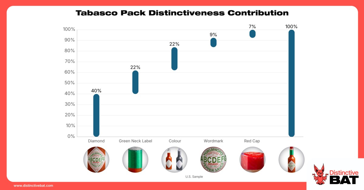
When discussing distinctive asset performance, such as packaging or ad style, it is often overlooked what is actually driving that success. Which variables matter most? What is the individual contribution of each? And what isn't contributing at all? We answer this for clients through a mix of Recessive Isolation and regression modelling, helping us determine the contribution, and therefore the importance, of individual assets. Take Tabasco, for example. The brand has five main variables contributing to its packaging distinctiveness, but our modelling reveals just three real drivers: the diamond label, the bottle colour, and the green neck sleeve. While it’s clear the diamond label is the ultimate hero asset, it’s also important to have clarity on when other assets are required (or indeed dropped, to allow for navigation codes and functional cues of the category to come to the fore). This kind of data helps inform future range extensions, portfolio design, and how other assets can or should be used. It is important that a brand's asset hierarchy is identified and clear to all teams, ensuring a consistent design system. This prevents smaller extensions from failing to build the mother brand's equity and protects key DBAs from being diluted across the range. Read more in the link below.

6 of 206 adsSign up to see every Distinctive BAT ad, filter by format and date, and get alerts on new ones.
See all 206 adsWatch the companies you care about.
Filter every ad by industry, country, format and network, and get alerts when a company you watch starts running new ads.